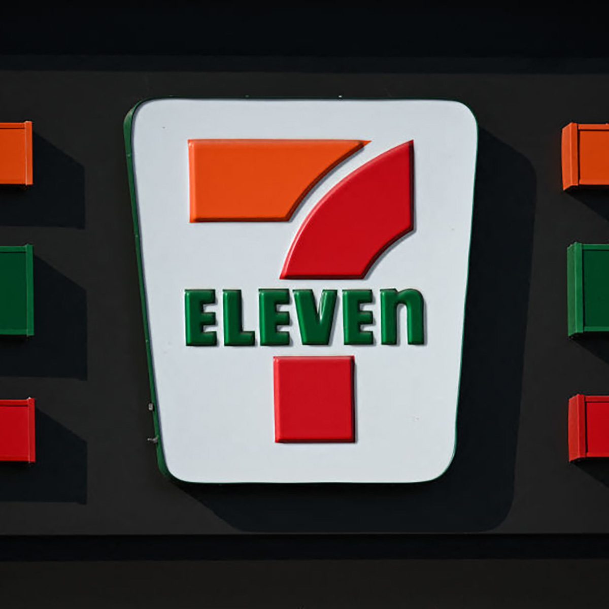
Why is it 7-Eleven, not 7-11? Why does the 7-Eleven logo have a lowercase "n"? We answer all the questions about the 7-Eleven logo meaning.

Here’s Why the 7-Eleven Logo Looks Like That

Have you ever looked at a brand’s logo and thought, “How? Why? Who did this?” Because there are some head-scratchers out there, though the best ones just add to the allure of the company. Like the 7-Eleven logo meaning. At first glance, it’s pretty straightforward, but if you look a little more closely, you’ll notice there are some nuances to it.
Like, why is the 7 a numeral but the eleven is spelled out? And why, in the modern logo, is the n the only letter not capitalized? These are deliberate choices; after all, everything in a brand logo is a choice. Even when Walmart debuted a “new” logo, the minimalist changes made were choices. Read on to learn about the meaning behind the 7-Eleven logo.
Get Reader’s Digest’s Read Up newsletter for more news, humor, cleaning, travel, tech and fun facts all week long.
What’s the history of 7-Eleven?
It’s hard to imagine a time before convenience stores existed, but prior to 1927, you’d have been hard-pressed to find one. That’s the year the first iteration of 7-Eleven, then called Southland Ice Co., came to fruition. According to 7-Eleven’s corporate website, it was situated on the dock of an icehouse in Dallas. Then, in the 1950s, the retailer expanded, adding locations in Florida, Maryland, Virginia and Pennsylvania under the name 7-Eleven. The name took its meaning from the store’s hours, which, at the time, were 7 a.m. to 11 p.m.
The 7-Eleven logo meaning back then isn’t much different from what it is today, but it has undergone some updates since the ’50s.
What is the logo supposed to signify?
In the early days, the 7-Eleven logo was meant to signify that the convenience store was open from 7 a.m. to 11 p.m. However, that all changed way back in 1963, when an entrepreneurial 7-Eleven outpost owner in Austin, Texas, decided to try a 24/7 business model for its store. The concept took off, and all 7-Elevens became 24-hour operations, seven days a week.
Why is the 7 a numeral but the Eleven is spelled out?
Simply put: It’s a marketing tactic. By mixing up the numeral with the type, “it creates an element of novelty that typically makes the marketing content (in this case, the brand logo) more likely to stand out and more memorable,” says Vassilis Dalakas, PhD, professor of marketing at the Fermanian School of Business at Point Loma Nazarene University in San Diego. “Another example is Chick-fil-A spelling their name with a capital A instead of “chick (or chicken) fillet,” he says.
Dalakas goes on to explain that combining a number in numeral form with a number that is spelled out, makes a logo stand out compared with a number that is all numbers or all words. But perhaps even more important, it ensures that people know that the 11 is supposed to be eleven and not one-one.
Why is the n in 7-Eleven’s logo not capitalized?
Again, nothing about a brand logo is left to chance, and the lowercase n with the otherwise capitalized letters in Eleven serves a purpose.
“The lowercase n in the 7-Eleven logo wasn’t a mistake—it was intentional,” says Nakia Gray, an intellectual property attorney and brand strategist. “Allegedly, it was the president of the company’s wife who thought the all-caps ELEVEN looked too harsh, so they softened it by using a lowercase n. That one small design choice made the brand feel friendlier and more approachable—and it stuck.”
How has the logo changed over the years?

Surprisingly, not much. Initially, in the 1950s, the logo was a giant numeral 7 with Eleven written in all caps at an angle across the middle of it. Today, you’ll find that, similarly, the logo is a large numeral 7 with Eleven written across its center, with the E-l-e-v-e in caps and the n lowercase.
When 7-Eleven became a 24-hour store in 1963, it didn’t inspire the company to change its name, thanks to established brand recognition, despite the 7-Eleven logo meaning losing a bit of its visual juice.
“The brand name is so well-known and established that changing it to reflect the actual hours the stores are open, in my opinion, would create more harm than good,” Dalakas says. “It not only has the potential to create confusion in recognizing the new brand name as the 7-Eleven brand, but also risks losing valuable brand equity it has gained over the decades.”
Perhaps the other biggest change was in 2019, when the company decided to drop the green from the logo’s background in an effort to make the company name stand out more.
About the experts
|
Why trust us
At Reader’s Digest, we’re committed to producing high-quality content by writers with expertise and experience in their field in consultation with relevant, qualified experts. We rely on reputable primary sources, including government and professional organizations and academic institutions as well as our writers’ personal experiences where appropriate. We verify all facts and data, back them with credible sourcing and revisit them over time to ensure they remain accurate and up to date. Read more about our team, our contributors and our editorial policies.
Sources
- 7-Eleven Corporate: Our Brand Story
- Vassilis Dalakas, PhD, associate dean of graduate and professional studies and professor of marketing at the Fermanian School of Business at Point Loma Nazarene University in San Diego; email interview, July 2025
- Nakia Gray, intellectual property attorney and brand strategist; email interview, July 2025


